

A lot of AI-built websites are not ugly. That is why the problem gets missed.
The page can work, animate and even impress the founder while quietly telling the market the company is not ready.
I see this constantly now.
Someone shows me a website. My first reaction is often the same. This is fine. This is presentable. This is better than what many people used to be able to produce on their own.
Then I look longer.
I look at the market. I look at the competitors. I look at the kind of buyer the site is supposed to persuade. I look at the logo, the typography, the spacing, the rhythm of the layout, the imagery, the claims, the level of proof, the parts that feel like AI defaults and the parts that show somebody actually made decisions.
That is usually where the problem appears.
The site is not necessarily bad.
It just looks cheaper than the business wants to be.
That is a serious problem, because buyers, investors and partners do not separate design judgment from business judgment as neatly as founders do. They assume the surface is telling them something about the standards underneath.
The signals I notice first
Almost all of the usual suspects matter, either consciously or subconsciously.
Weak font choices or weak font combinations. A logo with no real concept behind it. Unnecessary animation. Mismatched stock images. Generic claims. Poor line height. Flat spacing. Inconsistent padding. A page rhythm that never settles. Sections that feel like templates glued together. An obvious “I have seen this a hundred times before” feeling.
Sometimes the problem is even more basic. The design does not match the market at all. A company selling something sentimental, reflective or emotionally important is presented in blood-red aggressive colours because someone liked the palette in isolation. A technical infrastructure product is made to feel like a lifestyle mood board. A high-ticket service looks like a startup template from a discount builder.
None of those choices have to be disastrous on their own.
Together, they accumulate.
One weak decision rarely ruins a site. Ten acceptable ones can quietly destroy the impression of value.
Hard to build is not the same as high value
This is one of the biggest confusions in the AI era.
I see websites with working dashboards, responsive layouts, multi-step flows, complex functionality and clean front-end execution. Clearly, real effort went into them. Sometimes real engineering skill went into them.
They can still feel commercially weak.
Why? Because “hard to build” and “high value” are not the same thing.
The market does not reward effort just because effort happened. It responds to what the work signals. If the interface looks generic, if the message sounds generic, if the brand feels borrowed, if the proof is thin, then the site will still lower perceived value no matter how much work went into making it function.
A serious buyer does not say, “I can tell this took months to build.”
They say, “This feels premium.” Or they say nothing and move on.
What world-class sites do differently
When a site feels expensive, it usually is not because it is full of decoration.
It is because experienced people exercised restraint.
Nothing extra. No filler. No effects added just because they were available.
You instantly know what matters first, what supports it, and what to do next.
Type choices, sizes, spacing and rhythm feel considered. Designers obsess over this for a reason.
Every visual supports the narrative. The images do not merely fill space.
Spacing, colour, motion and visual weight work as one system instead of as isolated choices.
Not template logic. Not AI defaults. A brand system.
Real evidence. Real signals. Real reasons to believe the company belongs in the market.
Experienced designers and strategists usually remove more than they add.
Expensive sites breathe. They do not panic. They do not try to prove everything with every section.
The category leader test
A design can look attractive in isolation and still look weak beside the companies it is actually competing against.
This is why competitive context matters so much.
Many founders judge their own site against a blank screen, against their old version, or against the fact that AI helped them produce it quickly. Those are the wrong comparisons.
The real question is what happens when your site sits beside category leaders, investor-backed competitors or the kinds of companies charging the same prices you want to charge.
Does your site still feel credible then?
Does it still feel disciplined?
Does it still feel like the company understands what serious buyers expect?
If not, then what looked “good” in isolation may already be underpricing your own business.
Where AI usually goes wrong
In my view, the summary is simple.
AI is good at output. It is bad at judgment.
That shows up in familiar ways.
Too many effects. Familiar gradients. Generic sections. Industry-agnostic layouts. Every element competing for attention. Polished fragments with no larger coherence. Visual confidence without strategic clarity.
AI can produce the section. It cannot reliably decide whether that section belongs, whether the message is believable, or whether the final page feels like your market's top tier.
That does not make AI the villain.
It makes judgment the scarce resource.
Redesign is not decoration
One of the biggest misunderstandings founders have is what redesigning actually means.
They think it is mainly a prettier logo, a better colour palette, some stronger images and maybe a cleaner homepage.
That is not how I see it.
Real redesign is a credibility rebuild.
It is the process of aligning positioning, message, interface, proof, identity and market expectations so the company looks as serious as it needs to look.
It is also the process of removing weak spots. Cheapness is cumulative, so credibility has to be cumulative as well.
If you want to be taken seriously, you have to look serious. Not trendy. Not merely modern. Serious.
Why I changed ReBrandMyAI itself
This is one of my favourite kinds of work.
I like taking something presentable, something that many people would accept, and redesigning it until it starts producing the right assumptions.
ReBrandMyAI itself is a good example.
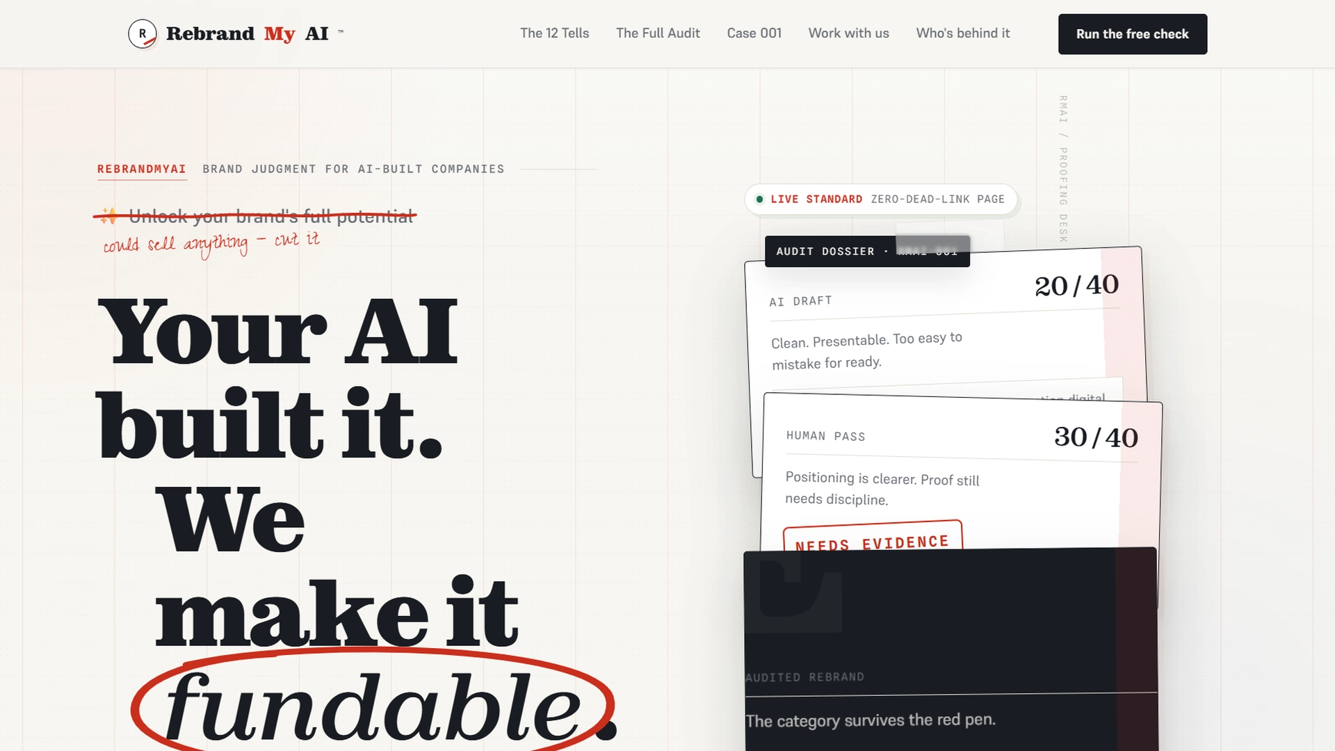
I had an earlier AI-led direction that some founders would have viewed as a triumph. It was striking. It was editorial. It looked intentional. But it leaned too far toward a boutique creative-agency aesthetic.
That was not enough for what ReBrandMyAI actually is.
What we are selling is not just graphic design. We are selling a coordinated technical and visual system. A serious founder should feel that this is a network of senior UI/UX experts, software engineers, project managers, compliance people, security experts, technical leadership and commercial judgment operating under one standard.
An early AI-led direction versus the current ReBrandMyAI front end.
The first version was not embarrassing. That is exactly why many founders would have stopped there. I did not.
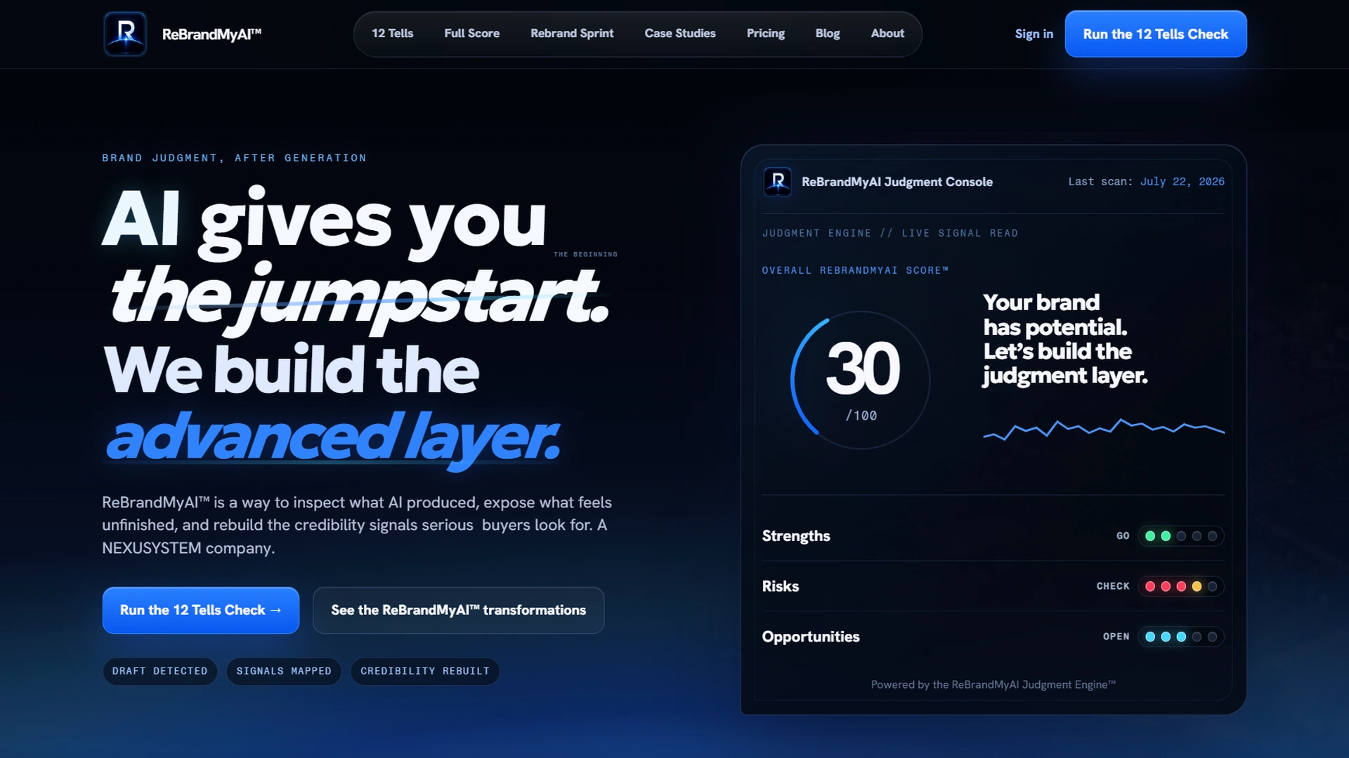
The current dark direction feels like premium technical infrastructure, not just a creative service.
“AI gives you the jumpstart. We build the advanced layer.” positions AI as utility and judgment as value.
The score rings, audit grids and diagnostic modules make the platform feel engineered and systematic.
The current system communicates disciplined credibility before the visitor even reads much copy.
The light version was a strong piece of art. The dark version is a more credible digital product.
That difference matters.
The commercial cost of looking cheap
The consequences usually show up quickly.
Buyers question the price. Investors assume immaturity. Partners feel less confidence. Users hesitate to trust the product with payment or data. Marketing brings people in, but the site cannot close them. Strong products get judged like weak competitors because the brand signals “small, early, unproven.”
None of those people sit down and write you a note explaining that the line height was off, the type hierarchy was weak and the visual language felt templated.
They simply form an impression and move accordingly.
That is why a cheap-looking site can be so expensive.
Find out what your website is making serious buyers assume about your company.
The Full ReBrandMyAI Score goes deeper than surface aesthetics. It reveals where positioning, proof, interface and trust signals are lowering perceived value.
When to bring in ReBrandMyAI
You bring in experienced people when the decisions start carrying long-term consequences that will be expensive to undo.
That means when the product works but the brand does not match its quality. When you want to raise prices. When investor conversations are approaching. When marketing is producing traffic without conversions. When different specialists have created disconnected parts. When the whole thing still feels like an AI-generated first draft.
At that point, more prompting is rarely the answer.
You need coordinated judgment.
You need people who can decide not only what looks better, but what will actually make the market believe more.
What a serious buyer assumes
Founders often keep asking the wrong question.
Does this website look good?
The better question is this.
What is this website making a serious buyer assume about my company?
I want serious founders to read that question slowly.
I want them to take an honest look at the level of competition around them. I want them to face the limits of their own experience. I want them to see that hiring ReBrandMyAI is not an expense they can bypass. It is an investment in doing the work correctly before weak assumptions become expensive ones.
A cheap-looking website is rarely the result of one terrible choice.
It is usually the cumulative effect of dozens of acceptable ones.
Questions founders ask about websites that feel cheap
What usually makes a website look cheap?
Usually it is a cumulative problem: weak typography, generic claims, familiar AI defaults, mismatched imagery, thin proof, unnecessary motion and spacing that does not feel disciplined.
Can a technically advanced site still feel cheap?
Yes. Responsive layouts, dashboards, animations and sophisticated functionality do not automatically create perceived value. The brand still has to look commercially mature.
Is AI the reason websites are starting to look the same?
AI accelerates familiar patterns, but it is not the true problem. The problem is accepting those patterns without enough judgment to challenge them, adapt them and remove what makes them generic.
When should I involve ReBrandMyAI?
Bring ReBrandMyAI in when the product works but the brand does not match, when marketing is not converting, when prices need to rise, or when serious investor, customer or partnership conversations are approaching.
This blog post uses trademarks and names for informational purposes only. All trademarks, brand names and logos are the property of their respective owners. Their use does not imply endorsement or affiliation.